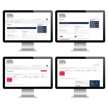
United Ad Label (UAL), a leading provider of B2B custom labeling solutions, launched a newly designed eCommerce website in late 2014. The updated site featured enhanced category and product pages, with a core objective of improving the user experience and increasing conversions. As a B2B business, UAL sought to drive higher transaction volumes, optimize its digital sales funnel, and create a seamless online purchasing process for its ideal customer profile.
Why Did We Start the Project?
The Challenge
Despite the strategic redesign of its website, UAL found that transaction volume was not increasing at the expected rate. While the new interface was cleaner and more intuitive, potential buyers were still encountering obstacles in the purchasing process.
As a B2B eCommerce company, UAL needed to refine its customer journey to align with the purchasing behaviors of procurement teams and corporate buyers. The company came to Marcel Digital to figure out the friction points in the checkout experience and uncover conversion optimization opportunities that would increase transactions and sales.

What’s Going On?
The Analysis
Marcel Digital’s conversion rate optimization (CRO) and UX/usability specialists deployed Hotjar and Clicktale to gather real-time behavioral insights. By analyzing user session recordings and heatmaps, we identified a critical drop-off point in the checkout process: buyers with full carts were abandoning their transactions before completion.
Upon closer inspection, we noticed:
- High-value B2B buyers hesitated before finalizing purchases.
- Users hovered their cursors over top navigation elements during checkout.
- Click data revealed that users were leaving the checkout process by engaging with navigation buttons.
This insight pointed to a fundamental issue in the digital purchasing experience - distractions were pulling customers away at a crucial conversion moment. To optimize UAL’s martech stack and digital sales funnel, we needed to refine the checkout flow to keep business buyers engaged through transaction completion.

How Marcel Digital Helped
The Solution
To eliminate friction and improve the checkout process, our UX team implemented a distraction-free checkout experience. By removing the top navigation menu on checkout pages, we streamlined the purchasing journey and kept customers focused on completing their transactions.
Key optimizations included:
- Designing a checkout experience without top navigation elements to minimize distractions.
- Simplifying steps within the checkout process to reduce unnecessary actions.
- Conducting an A/B test: 50% of users experienced the original checkout, while the other 50% navigated the optimized flow.

What Happened After Launch?
The Results
The impact of this CRO initiative was immediate and substantial. By removing navigation distractions in the checkout process, UAL achieved an increase in the overall conversion rate by 72% and an increase in transactions by 38%.
This solution not only delivered a short-term revenue boost but also provided lasting value by optimizing UAL’s digital sales pipeline. Today, the streamlined checkout process continues to drive higher conversion rates, improving lead generation and increasing the efficiency of UAL’s eCommerce sales strategy.

Ready to start your project?
Our team would love the opportunity to hear more about your needs. Fill out the form, and we'll reach out to you shortly.