Using Conversion Rate Optimization To Influence Your Site Redesign

A website redesign can be a tedious undertaking. Beyond all of the meetings, opinions, and tasks to make a redesign happen, you need to know WHY you’re redesigning your site and HOW you want the site to layout once the redesign is complete. Basically, what you need first and foremost, is data to influence the decision to redesign your site.

One thing we’ve found at Marcel Digital is when you say “redesign” to an executive or designer, it can come across as if you’re calling their child ugly. It’s totally understandable - your website is an extension of your brand and digital presence. You put a lot of hard work into your website and are proud of it! You should be! But once you take a step back and allow yourself to separate from your website, you’ll see the weak points in your website and how users are really engaging your website. Sometimes, it may not be a redesign you need, but merely moving a button or updating content. Point blank - data is your best friend in this case, and will help you understand what your site truly needs.

Use Data To Make Your Case

Building a case for a website redesign takes data. Without data, a redesign is like getting into your car and driving aimlessly; you may eventually get somewhere but you’re going to have a hell of a time getting there, and you’re probably waste a lot of time and resources (aka money) in the process. You need a map and understanding of what your goals are, your client goals are, and aligning both in a cohesive strategy that sees both parties benefiting from the experience.

If you have a website, you should have Google Analytics or some sort of analytics in place to help you understand how your website is performing. If you don’t have an analytics software installed on your website, you need to get one in place to help your company make data driven decisions to improve your website performance. Here is a list to help you get started. You’ll also need a strategy in place for your metrics to make your analytics work effectively for your business.

Md GA

Next, you need to know what metrics are most important to your website and will help you make your case for a redesign. Some metrics to consider:

  • Landing page - Important to know because these pages let you know where users are starting when they land on your website. Consider these pages a “first impression” for users and what content they are engaging with as they land on your website.
  • Bounce rate - Important to know because this metric will tell you what percentage of users are landing on your site and leaving before going to another page on your website. Coupling this data with landing pages will tell you if your users are finding what they need as they land on your website, both from a content and call to action standpoint. The higher this number, the more research is needed.
  • Time on site - Important to know because this metric is showing how engaged with your website users are. From moving through your site page by page, to reading or viewing content, the higher the number usually means your site is engaging. The lower the number, the more research is needed.
  • Exit rate - Important to know because this metric will help you pinpoint where users are exiting your website most. This metric goes beyond bounce rates, because this metric shows what page users are leaving at the end of their session on your website. The higher this number for a page, the more research is needed.
  • Conversion rate - Important to know because this metric is the main reason your website exists. Ultimately, you want users to land on your website to take an action that your team has deemed most important. This can be anything from filling out a form to viewing a video, from downloading a PDF to purchasing a product. The higher this number, the more users are finding your website engaging enough to take action. The lower this number, again, the more research is needed.

It’s important that you sit down with your team and discuss what metric are most important to your website and business, particularly on a page by page basis - not all pages have the same purposes. Knowing this will help your team make the data driven decisions you need not only for a website redesign, but also in making your website and user experience the most effective they can be.

Use Data To Influence Design

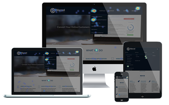
Md Heatmaps

If you want to take data a step beyond the numbers and metrics, visuals offer a more direct look at how users are engaging with your website. Depending on which members of your team you’ll be presenting to, you’ll need to understand their communication styles. Some members of the team may love numbers, graphs, and do fine with Analytics dashboards, but some decision makers may better understand visuals to interpret data. These can include:

  • User videos
  • Heatmapping
  • Click mapping
  • Scroll mapping
  • Screenshots
  • Etc.

As a Hotjar Founding Member, Marcel Digital firmly believes in the use of visuals when presenting the case for website redesigns or layout updates. The reason visuals are so effective is because they show you exactly how users are navigating your website, where their issues are, and what elements on a webpage are working most in your favor. By leveraging the information that visuals present, you are more equipped to create hypotheses that you can then test before assuming and implementing.

Test Your Ideas

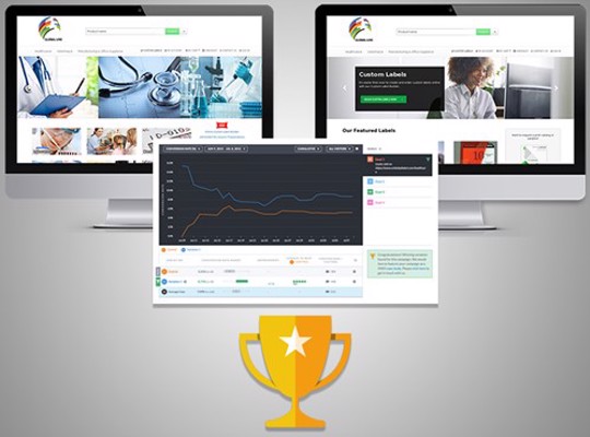
By now, you’ll have more than enough data to help you find what pages or sections of your website are underperforming. With services like Conversion Rate Optimization, or CRO as it’s also known, you can test different design or layout ideas against the current design of your website or web pages. This is an invaluable service to add to your ongoing strategy, as it help your team ensure that new designs or elements will perform more efficiently than current layouts.

Md Design

Testing any assumptions or gut feelings when it comes to website changes are extremely important because until they are proven with data, that’s all they are - assumptions or gut feelings. Same with “best practices” or case studies; every website’s audience is different and react to layouts or elements differently. All ideas for new layouts need to be tested thoroughly before implementing so that you can ensure they will work in your website’s favor.

There different types of tests you can run on your website:

  • A/B testing - An A/B test is where you divide your traffic to go to two different variations or the same page. On these tests, you are usually testing changes in a headline, buttons, images, or other elements.
  • Multivariate testing - A multivariate test gives you the ability to test multiple element changes on a webpage. This type of test should be ran by advanced marketers or Conversion Rate Optimizers, and is not recommended for beginners.
  • Single URL testing - Split traffic to two different URLs of the same landing page with different designs. This goes beyond element testing, and instead are usually different layouts entirely.

Depending on what testing ideas you have or layouts you have in mind, you’ll want to know which one of the tests above will most effectively help you in testing your assumptions. Know the differences between them and begin prioritizing which ideas will have the biggest impact based on your website and client goals.

Measure Results, Prioritize What Worked

After you’re done testing it’s important that you take a look at the results of each test you’ve ran and decide whether a full blown redesign is in order, or if it’s just a case of needing to move a couple of elements around. The results of these tests will help your team decide what changes are necessary from your website, and from there you can get a gameplan in order for next steps.

Remember, at the end of the day the reason for testing assumptions is to not waste your company’s time or resources for something you may not at all need. There are so many other factors to consider in a website redesign, including mobile usability, branding, your CMS platform, and much more. User experience, while a huge portion of your website’s performance, is only a part of the conversation, and you need to be equipped with data for multiple parts of the conversation.

After your test results, discuss the following with your team:

  • Results
  • Tests with most impact
  • Tests with least impact
  • What you learned most from the testing process
  • What you would do different next time
  • Next steps and long term testing strategy

Discussing all of the above will help your team get on the same page and have an honest conversation about what your website truly needs, whether it’s a redesign or a few changes. Either way, you’ll find that the CRO process has been a beneficial item to add to your website’s ongoing strategy, and one that will pay dividends in the long run. Always take the time to review data, prioritize your findings, test your assumptions, ask the right questions, rinse and repeat. Doing so will see your site running optimally, your users happy, and keep you miles ahead of the competition.

If you’re interested in learning more about Conversion Rate Optimization, feel free to contact us! We’re always happy to help where we can and hear about your business’s digital goals. We want to be more than a consultant, we want to be your trusted business partner.

  • Conversion Rate Optimization

Kyle Brigham headshot

About the author

Kyle Brigham

Kyle Brigham is the Chief Strategy Officer at Marcel Digital. He specializes in client services and project management, but also original Nintendo games and ping pong.