Data is a beautiful thing - it helps us understand how things are performing, how successful our hypotheses are, and gives us the ability to make data driven decisions for the future. Data is the lifeblood of any company or brand that is looking to effectively market to its customers and stay ahead of the competition. That’s why it’s so important that companies leverage their data and analytics effectively in a way that helps them achieve their goals.
But sometimes, executives and decision makers aren’t numbers people. They don’t want charts or graphs or novel long reports, they just want the information in its simplest and truest form. As marketers and analysts, sometimes providing information in that form is hard, especially as we see caveats and areas of gray. But luckily, it’s not impossible.
Say It With Visuals
Humans want information quickly and efficiently. We don’t like having our time wasted or compromised, especially when it comes to complex ideas or information. One of the best ways to remedy this issue, especially for your executives who are short on time, is to provide visuals that say it all. When it comes to visuals:
- People remember 80% of what they see
- Visuals are processed 60,000x faster than text
Visuals are the most effective form of communication. For instance, did you know that 93% of all communication is nonverbal? While this reflects body language, it still goes to show that we are highly visual beings that process information with our eyes and mind. So, whenever we are trying to make changes happen in our company or on our website, use visuals. The information will be much more effectively communicated. But, when we want to make changes to our website, how do we convey that visually?
Effective Visuals For Website Optimization
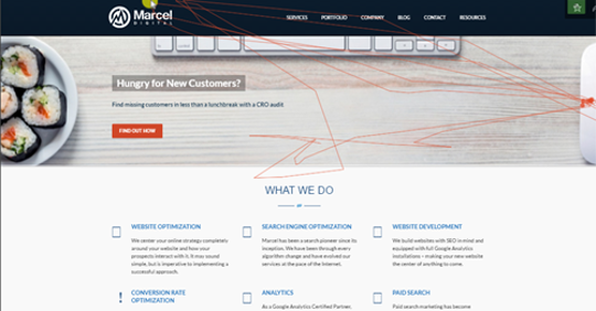
When receiving feedback about your website from users and analyzing your data to make changes to your website, be sure to include software that allows you to track a user’s movement and engagement on your website. Having this capability on your website is your first step to helping your team understand why changes are being suggested at a visual level. And even beyond that, it’s a real, live person on your website using the functionalities you put in place to help them make a purchase. It’s not a robot or a person paid to peruse your website; it’s a breathing user you are watching use your website.
What types of visuals can you utilize? At Marcel Digital, we use three:
- Heatmaps
- User videos
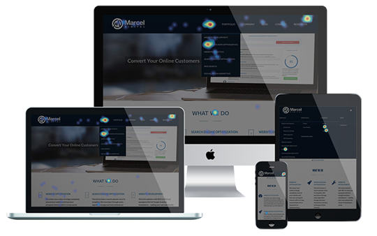
- Click maps
What Is A Heatmap?
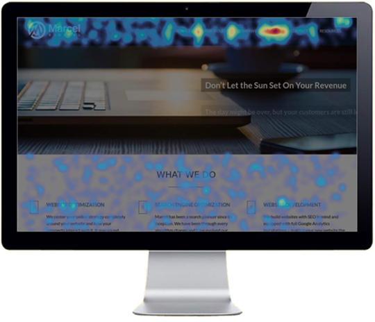
When it comes to a heatmap, the way we use this information is to analyze how far a user is scrolling down a webpage. We leverage this information to make sure that compelling information or calls to action are properly placed and that the users are reaching or seeing them the way that they are intended to be seen. When you see this type of mapping, you understand your content or media placement more and where it can be moved to be most effective.


Conversion Rate Optimization
About the author
Kyle Brigham
Kyle Brigham is the Chief Strategy Officer at Marcel Digital. He specializes in client services and project management, but also original Nintendo games and ping pong.