Responsive design ensures that your website adapts seamlessly to various screen sizes, providing an optimal viewing experience for users on all devices. This not only enhances user engagement but also boosts conversion rates.
Understanding Responsive Design
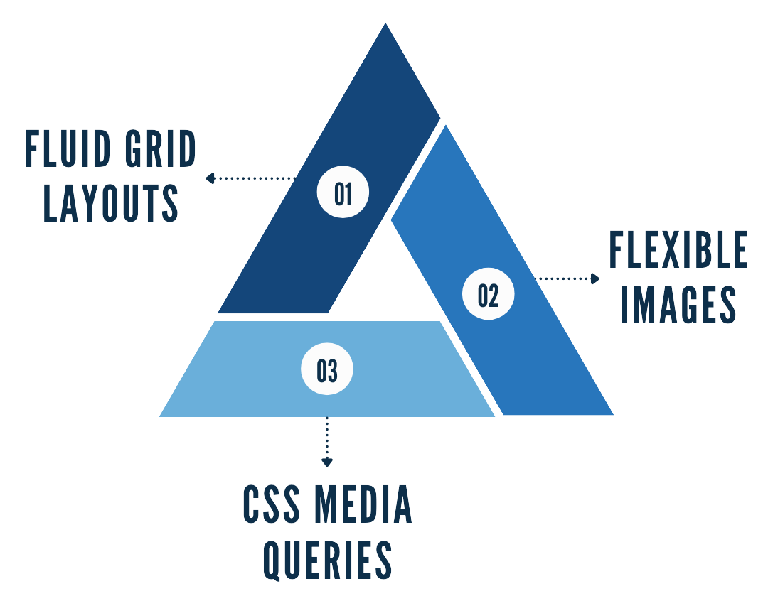
Responsive design is an approach to web design that makes web pages render well on a variety of devices and window or screen sizes. It involves using fluid grid layouts, flexible images, and CSS media queries to adjust the website's layout and content based on the device being used. Marcel Digital leverages the power of advanced CMS solutions, like Umbraco, to facilitate responsive design, ensuring seamless content management and delivery.
Key Principles of Responsive Design
- Fluid Grid Layouts: These allow the website layout to adjust proportionally to the screen size.
- Flexible Images: Images that scale with the layout to fit different screen sizes.
- CSS Media Queries: Conditional CSS rules that apply different styles based on device characteristics.
Enhancing User Engagement with Responsive Design
Improved Navigation
Responsive design simplifies navigation for mobile users by utilizing touch-friendly elements like hamburger menus and large buttons. This makes it easier for users to find what they're looking for, leading to longer session durations and lower bounce rates.
- Hamburger Menus: Collapsible menus that save space and provide easy access to navigation links.
- Touch-Friendly Navigation: Buttons and links designed to be easily tapped on touch screens.
Better Content Accessibility
Ensuring that content is easily readable on all devices is crucial. This involves using appropriate font sizes, line spacing, and contrast to improve readability. Responsive design also eliminates the need for excessive scrolling and zooming, providing a more pleasant reading experience.
- Font Size and Line Spacing: Adjustments to ensure text is readable on small screens.
- High Contrast: Improving readability by ensuring text stands out against the background.
Faster Load Times
Load times significantly impact user engagement. Responsive design techniques like image optimization and lazy loading can improve load times, ensuring that users don’t abandon your site due to slow performance.
- Image Optimization: Reducing file sizes without compromising quality.
- Lazy Loading: Deferring the loading of non-critical resources until they are needed.
Boosting Conversion Rates Through Responsive Design
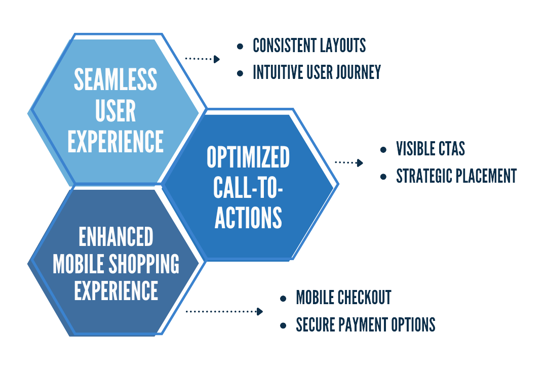
Seamless User Experience
A consistent and intuitive user experience across all devices is key to higher conversion rates. Responsive design ensures that users can navigate your site and complete desired actions, such as making a purchase or filling out a contact form, without any friction.
- Consistent Layouts: Ensuring that the website looks and works well on all devices.
- Intuitive User Journey: Simplifying the steps needed to complete a task on the website.
Optimized Call-to-Actions (CTAs)
Effective CTAs are crucial for conversions. Responsive design allows for strategically placed and highly visible CTAs that are optimized for both mobile and desktop users. This increases the likelihood of users taking action.
- Visible CTAs: Ensuring CTAs stand out and are easy to tap on mobile devices.
- Strategic Placement: Placing CTAs where users are most likely to see and interact with them.
Enhanced Mobile Shopping Experience
For e-commerce websites, responsive design is essential. A mobile-friendly checkout process and easy-to-use payment options can significantly boost mobile conversions. Customers are more likely to complete a purchase if the process is smooth and convenient.
- Mobile Checkout: Streamlined checkout processes optimized for mobile devices.
- Secure Payment Options: Easy-to-use and secure payment gateways for mobile users.
Technical Aspects of Implementing Responsive Design
Fluid Grid Layouts
Fluid grids allow your website layout to adjust proportionally to the screen size. Tools and frameworks like Bootstrap and Foundation make it easier to implement fluid grid layouts.
- Bootstrap: A popular framework for building responsive websites.
- Foundation: Another powerful framework for responsive design.
Flexible Images and Media
Responsive images and media queries ensure that images scale properly across different devices. Techniques like srcset and sizes attributes help in delivering the right image for the right device.
- srcset Attribute: Allows different image sources for different device resolutions.
- Media Queries: CSS rules that apply styles based on device characteristics.
CSS Media Queries
Media queries enable different CSS rules based on the device characteristics. Common media queries target screen width, height, orientation, and resolution, allowing for tailored styling that enhances the user experience.
Best Practices for Responsive Design
Mobile-First Approach
Designing for mobile first ensures that your website provides an excellent experience on smaller screens before scaling up to larger ones. This approach prioritizes the most crucial elements for mobile users and enhances overall usability.
- Prioritize Content: Focus on essential content for mobile users.
- Progressive Enhancement: Add more features and styles as the screen size increases.
Regular Testing and Optimization
Regular testing is essential to ensure your website remains responsive. Tools like Google Mobile-Friendly Test and BrowserStack help identify issues. Continuous optimization based on user feedback and analytics ensures your site stays up-to-date with user needs.
- Google Mobile-Friendly Test: Tool to check if your site is mobile-friendly.
- BrowserStack: A platform for testing across multiple devices and browsers.
Build a Responsive Website With Marcel Digital
Responsive design is a powerful tool for enhancing user engagement and boosting conversion rates. By providing a seamless and intuitive experience across all devices, responsive design ensures that users stay longer on your site and are more likely to convert. Implementing responsive design best practices can significantly improve your website's performance.
At Marcel Digital, we specialize in creating responsive, high-performing websites using advanced CMS solutions like Umbraco. Our team of experienced developers and strategists is dedicated to ensuring your website is not only visually appealing but also functional and user-friendly across all devices. Contact us today to learn how we can help you build a responsive website that enhances user engagement and drives conversions.
Want to Learn More About Umbraco?
Our team of experts is here to help. We've developed and launched Umbraco custom and uSkinned sites for businesses just like yours, helping you make the right choices along the way!

Ready to start your project?
Let's chat. Fill out our form, and our team will be in touch with you shortly.
Web Development
About the author
Alex Vilmur
Alex Vilmur is a wizard at development and also trumpet. He once auditioned for The Mighty Mighty Bosstones, but found his passion for website development and Umbraco made it too hard to leave.